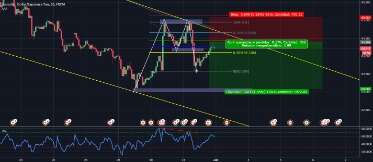
Renko charts, on the other hand, are created by only showing movements of a certain size. Renko’s huge disadvantage is that most indicators won’t show an accurate picture. Due to its design, candles reflect the market with a slight lag. To add it to the chart with default parameters, click “OK”. Most of the parameters are the same as for other indicators.
- Some of the currency pairs that fit the description are CADJPY or GBPJPY.
- The highs and lows are the highest and lowest values among the Heiken Ashi close and open bars’ prices and the extremum of the current Japanese candlestick.
- When the trend’s strength increases, candlestick bodies become larger, and before and during short-term corrections, they become smaller.
- Therefore, the tool is very efficient for highly volatile assets on small timeframes.
- Usually, this is not an issue for swing traders who have time to let their trades play out.
Japanese technical traders have made a big contribution to stock trading. Heikin-Ashi indicator is a prime example that even a very handy tool like candlesticks can be improved. Heiken-Ashi indicator is calculated based on four parameters.
Bullish Heikin-Ashi Trend
Traditional candlesticks use open and close prices to form the body of the candle and high and low prices as the wicks. The Heikin-Ashi formula uses a combination of four price averages – open, high, low and close values – from the current and previous trading sessions. The chart example above shows how Heikin-Ashi charts can be used for analysis and making trading decisions. On the left, there are long red candles, and at the start of the decline, the lower wicks are quite small. As the price continues to drop, the lower wicks get longer, indicating that the price dropped but then was pushed back up.
Take a closer look at the nearby bars to detect a reversal signal where the las few candles of the bearish trend are formed. The XAUUSD chart shows a bullish trend direction where the consecutive colored candles are. At first, there are almost no lower tails (indicated by the green arrow). Before the upward movement ends, this changes and nearly every bar shows a lower shadow. The picture above shows where to take the values of bullish and bearish bars.
How to read Heikin-Ashi candlesticks charts
Then, follow the trend closely and exit after a reversal signal or the start of a counter-trend price movements. In the image above, you can see that Renko chart fully realizes the goal of filtering out market noise. Renko bricks don’t show patterns like Japanese traditional candlesticks or take time into account. They react exclusively to price data changes in points for a certain period of time. The market picture is often visually different from Heiken-Ashi candles because Renko doesn’t consider sideways price movements.

Therefore, they indicate that a trend reversal is highly probable. Unlike Japanese candlesticks, HA Hammer can only be red candles or black, regardless of where it’s formed relative to the market trends. The Heikin-Ashi typical candlestick chart is often used as a trend indicator.
What do open and closed positions mean in Forex trading?
Below are some Heikin-Ashi strategies that can be utilized for the benefit of traders to increase their profits and margins. I know understand this Heike Ashi candles and going to give a shot. This means there is momentum behind the move, so it serves as a valid entry trigger for a bullish trend continuation. You can use then use it to easily identify the trend and hop into a trade (which I’ll explain more about next). Its Open price is half of the previous candle’s Open price + the previous candle’s Close price.

The Heikin-Ashi charts also obscure gaps and some price data. Then, using candlestick patterns, the changing candle shape, and technical analysis, I identify the pivot point. To lock profits, I use either a trailing stop or a trend reversal signal. The Hammer, also sometimes called the Hanging Man, is a pattern with small bodies, small or no upper shadows, and long lower shadows. During an uptrend, the pattern is referred to as the Hanging Man. In technical analysis, these patterns signify overbought or oversold conditions.
Heiken-Ashi patterns
The blue rectangle shows where the market runs out of steam, as there are multiple dojis. Notice that the next candle with any length to it at all is a red one, showing that the momentum is rolling over. This is quite common with the Heikin Ashi indicator, as it takes out so much noise. Hence, the technique generates a smoother chart making it easier to spot trends and reversals.
By comparing them visually, you can see that the lower chart is smoother. It shows no gaps, and many bars are opened closer to the middle level of the previous bars. High waves are bars with long and roughly equal upper and lower shadows. Such patterns, like Doji, indicate the balance of buyers and sellers and may be the first signal of a bullish or bearish trend movement that is coming to its end.


